Driving
through the redwoods of San Francisco’s Presidio you hope you’ll
come across people doing work to rival the tree’s majestic beauty.
I wasn’t disappointed when I met David Sibbet, founder of the
Grove Consultants International and Ed Claussen, Grove’s general
manager. They led me through the halls of an old Queen Anne Victorian
that had been converted into workspace for some 24 visual cartographers
at a company that turns ideas into art; theory into story; visions
into working, tangible histories that speak louder than anyone
could shout amongst the trees. I learned of Grove’s business several
years ago while attending a meeting put on by Don Tapscott’s organization.
They had hired a Grove consultant to facilitate some of the sessions
and graph our work processes. Years later I recall and use lessons
from that session, not just because of the content of the meeting
itself, but because of the connections the cartographer was able
to graph for us, bringing vision to ideas in a vibrant way.
For
an issue around design, who better to go to than the heart of
Grove’s business and the artistic as well as strategic force behind
the organization that, over the last decades, has been responsible
for such works as Harvard Business Review’s 75th Anniversary
Timeline of Management Practices seen on thousands of leaders’
walls, the sixteen foot long vision image that helped turn around
National Semiconductor in the early 1990’s, or the majestic map
that charted General Motor’s history? Sprinkled throughout this
interview are some of those graphic images because, frankly, only
speaking with David Sibbet wouldn’t do his magic justice—though
his words are far more powerful than those spoken by someone with
far less to show.
Conner:
You seem to help people experience something they wouldn’t normally
do in a standard meeting or strategy session. What you do is to
help people walk through, work through, and feel something at
a deeper level than ordinary facilitation tools I’ve seen. How
did you come up with this model?
Sibbet:
The seed to this particular way of working started with creating
quad posters in college and flowered during eight years I spent
with the Coro Foundation,
a very innovative training institute that prepares people for
public affairs work. Coro has been in existence since 1942 and
now has centers in six cities. What’s interesting about Coro is
that it was one of the first and most adventurous experiential
training organizations. Their entire program is immersive rather
than lecture based. They take 12 different fellows and string
together a series of internships over a period of nine months.
For example, on an initial round of government internships somebody
would be placed in the mayor’s office, somebody in planning departments,
somebody in public works. Then they would come together on Fridays
and try to make sense out of how the city works. After I went
through the program in Los Angeles, I ran the San Francisco Center
for several years.
Conner:
What led to the group graphics?
Sibbet:
Our neighbors at Coro included the facilitation company, Interaction Associates,
who used a facilitator/recorder model for problem solving and
running meetings. They had a big grant to study how kids really
learn and solve problems. They observed that human beings use
many different heuristic processes (basically cycles of activity
which shift as you learn) to discover solutions, and that these
processes were teachable. Their project was aimed at placing “tools
for change” in the hands of teachers to help them teach problem
solving. Being next door to Interaction introduced us to new ways
of thinking, some of which came from Doug
Engelbart and his project at SRI on augmented human intellect.
One of the people who came to Interaction from that project was
a fellow named Geoff Ball. He had written a paper on explicit
group memory. This paper stated very clearly that of all the experimentation
they did at SRI, the thing that made the biggest difference in
a working group being productive was having a working group display.
As Paul Saffo, at the Institute of the Future is fond
of saying “Paper is brain interface.” The way we know what we
know is we write it down and we draw pictures. At Coro we took
IA’s flip charts and turned them into 16-foot long, highly graphic
working displays. The results were amazing.
We
did this work at Coro in the context a theoretical orientation
to communications informed by general semantics. Coro’s founders
met Alfred
Korzybski (the father of general semantics) when he was on
tour in the United States in 1938. They were really inspired by
the idea that language and language structure have an impact on
perception and action, and worked to see how this played out in
the public arena. Korzybski’s point of view was that part of the
insanity of the modern world is derived from errors propagated
by our language structures. He said if we would only change the
way we talk, we would change the way we think and perceive.
Part
of what Korsybski attacked was the Cartesian idea that man is
a rational animal. He preferred to define humans as “thinking,
moving, electrochemical, feeling entities in a continuous semantic
transaction with their environment with a memory of past transactions
and projection of future ones.” This is a mouthful, and a precursor
to the idea that we have different modalities of learning. Many
theorists have argued that there are kinesthetic learners, auditory
learners, visual learners, in fact, it’s so obvious now that this
has almost become a cliché.
But
the “thinking, moving, feeling, electrochemical person in constant
semantic transaction with its environment” was the way Coro thought
about learning in 1948 and with this model, called the “semantic
transactor” we were really trying to bust the idea that you learn
by thinking clearly. In fact, Don Fletcher, Coro’s founder, believed
that clarity stopped thinking. He contended that clarity actually
stops the process of learning because the brain automatically,
once it sees a pattern and understands it, goes to the next thing
and spends all its time on the stuff it doesn’t understand. Because
of this idea, Coro staff (of which I was a member) was not allowed
to lecture. We were only allowed to construct experiences that
would optimize the chance that the learner would run into something.
Conner:
I can see how the ideas started coming together from all over.
Sibbet:
What we learned led us to what would is now called project-based
learning, or discovery based education. Collaboratively creating
graphic displays as a way to support people sharing their experiences
with each other fit right in with the indirect, immersive approach.
I
came to big graphics accidentally. When I was a freshman at Occidental
College in Los Angeles in the early 1960’s, Terry
Gilliam, the animator for Monty Python, was one of the seniors
who was busy humiliating us freshman by creating big advertising
posters for the senior activities during hazing week. His stunning
work made the seniors look really great. Two of us freshmen decided
to fight back, got poster paint, and started trying to be as good
as Terry Gilliam. We weren’t, but I was good enough that I was
asked to do huge quad posters all the way through college. I did
a lot of big format work as a sideline. All the time I was stretching
to be as creative as Terry, our standard.
During
this same time I became editor of the college paper, went on to
get a Masters Degree in Journalism from Northwestern, and worked
at the Chicago Tribune. While reporting on the incredible urban
developments occurring in Chicago, I became convinced I should
be an architect and urban designer and spent several years heading
toward that career, but Coro offered me a job and I turned in
another direction.
When
I eventually found myself standing in front of a group of Coro
Fellows and applying Interaction Associate’s recording methods
to our group process, my journalist orientation to story came
together with poster-maker/architect, and “Group Graphics” was
conceived. I remember the first session vividly. We wanted to
look at how the power structure of city hall and city government
worked so we put up two huge sheets of paper, about 8 feet tall
and about 20 feet long and just asked simple questions like “What’s
one of the agencies in the department of public works?” “How many
people in it?” I asked. “Well 70,000” they replied but we weren’t
quite sure so I drew a box. Then there was the police department.
I asked, “Is it inside that box? How big is it relative to public
works?” It was maybe a quarter of the size so we ended up mapping
all the boxes nested or not and started doing links. We did what
any good consultant would do now when looking at a business process.
We drew a picture of it.
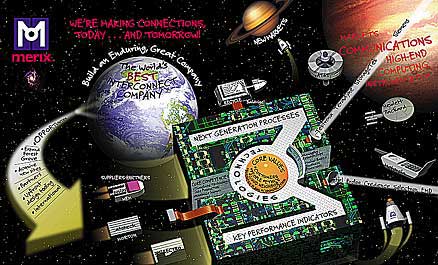
Graphic Vision:
Merix
Three
hours later, with no one asking for a break, people were on the
edge of their seats, deep into the finesse of how city government
really worked. The whole presentation was supported by our large
display. We saw where each fellow was interning and the web of
connections between agencies and other organizations. I realized
we were in the middle of something that really worked. The amount
of engagement and participation was exceptional. For five years
I was incandescent with experimentation and the fact I could,
just by boarding and mapping and drawing and illustrating a group’s
thinking in real time, augment the group’s intelligence and never
give a lecture.
Conner:
What a valuable experience.
|
|
|
Graphic
Vision: Save-the-Redwoods
|
Sibbet:
Yes indeed. So that’s the root of what we do at the Grove. When
people struggle with things themselves they learn: but when they’re
given things, neatly packaged to consume, they consume but I don’t
think they are really learning. You may get something out of it
but it’s not the same as doing it yourself. There’s no better
way to learn than to try to teach something or to try to write
an article or to try to draw a picture.
In
hindsight, those years seem like a ‘Eureka!’ experience. But at
the time, I wasn’t trying to do anything special. I would just
get up and, because I could draw and was a journalist, I’d go
for the story and try to illustrate it. I wasn’t working with
any theory about visual thinking or theory about learning in particular
other than general semantics. I’d just get swamped with how fun
and rich and effective these meetings were when supported this
way. Then I began to get into the theory and subsequently have
come to understand why we were getting such great results.
Conner:
You mean the theory of individual thinking or the theory of visual
learning?
Sibbet:
Oh, learning in general.
Conner:
Anything specific that’s influenced that?
Sibbet:
Well the big breakthrough for me came in the mid 1970s... I don’t
know how theoretical you want to get.
Conner:
...as theoretical as you’d like to get.
Sibbet:
In 1976, I was about four years into Group Graphics. I started
to look at the different ways I could visualize things, and began
collecting diagrams and maps and flow charts and matrixes and
clusters. I gathered every format I could find but the whole didn’t
make complete sense to me. Some of the formats worked well. Others
were difficult. We tested many different approaches in Coro seminars,
even though most facilitators at the time just listed things on
flip charts, and didn’t use many graphics. I was interested in
seeing how things fit together and observing the systems thinking
part. I was diagramming and mapping from the start, probably influenced
by my urban planning interests now that I think about it.
My
theoretical understanding took a huge jump forward after meeting
a man named Arthur M. Young. Arthur taught in Berkeley through an organization he
formed called the Institute for the Study of Consciousness. He
was set on trying to update the scientific paradigm. A mathematician
and physicist by training, and inventor of the Bell helicopter
by profession, he had spent 35 years developing a theory of evolution
that was process oriented rather than structurally
oriented. Arthur believed that when trying to understand how things
work, you need to appreciate that in nature, some things are more
fundamental than others. “Fundamental” means that one thing
is required for something else to exist. A good example would
be water and waves. Water is fundamental to waves. Waves need
water to be waves; water doesn’t need waves to be water. So you
can say water is more fundamental than waves.
Conner:
I think of the primary colors.
Sibbet:
Yes. You could go even deeper and say that for water, oxygen and
hydrogen are fundamental. Then you might say more fundamental
than that are the fundamental “particles” scientists call protons
and neutrons. If they didn’t exist, nothing else would either.
Down
at the bottom of all this, the most fundamental thing discovered
by scientists is light, sometimes called photons or quanta of
action. Accepting light as the most fundamental thing in the world
created a disturbance at the heart of science. Light, as far as
anyone can tell, is completely unpredictable. Even though scientists
say it’s a constant, some now are not even sure that that’s true.
Light definitely doesn’t have weight, size, location, or anything
else that you can pin down. It seems to be highly indeterminate
so how can the whole world be built on complete uncertainty and
still have predictable, physical laws, like gravity and all those
wonderful things of chemistry. How can that be?
This
is a great big question because up until the mid-20th century
science principally believed that its main mission was to describe
what was certain and predictable. Uncertainty was a big annoyance,
and everyone kept trying to eliminate it, and all of its associated
phenomenon—the observer consciousness, will, intention, vision,
motivation—all those things that are fundamentally human and are
traditionally excluded from science. Our ancestors built our whole
modern civilization on the dream of man as a rational animal;
and at the root science discovers uncertainty!
Modernists,
in general, hope that through technology, clarity, and a thorough
understanding of predictable processes, we’ll get it all together.
Now science is finding out that the most fundamental thing is
light or fundamental forces which, themselves, are very erratic
and unpredictable.
Young
set out to update the scientific paradigm and explain how this
can be. In his comprehensive theory of evolution, laid out in
marvelous detail in his seminal work, The
Reflexive Universe, he suggests that the way things move,
is more fundamental than the way they appear, and that energy
is more fundamental than mass. He also suggests that “light” and
“will” or “consciousness” are virtually the same, and that this,
indeed is fundamental to everything else. These ideas were radical
in the mid 1970’s when I first encountered them, prefiguring Willis
Harmon, Ken Wilbur, and Frijoff Capra, some more recent thinkers
who have made similar observations.
I
saw another feature in Young’s work. He not only had the only
really rigorous theory in the consciousness movement, but he also
described it all with graphics! Young chose to use geometry as
one of his languages. He used angular relations, visual display,
and geometric portrayal on a sheet of paper. He also used measured
formulas from engineering and metaphors from ancient mythology.
He combined these three languages, plus mathematics, to describe
and characterize his theory.
I
joined his study group in 1976. A committed inventor, he said,
“Test my theory against what you really know. Tell me what’s wrong.”
He believed his theory could describe ANY process in the universe.
Well
what I really knew was group process and the process of visualizing
in groups. So I took Young’s theories and, between 1976 and 1981,
began a full investigation of visual thinking and how you look
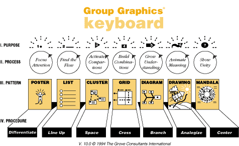
at it from a process perspective. In the very first year, I developed
a grammar for visual language based on a process perspective that
to this day is one of the structures behind how we work and teach
our product technology. In retrospect, it’s actually a simple
insight.
If
you look at graphics and try to understand them as artifacts and
structures like you would a finished blueprint or a drawing, you
would be taking a structural view, focusing on the lines, colors,
and other elements in relationship with one another. There is,
however, a more fundamental aspect you could pay attention to:
namely the process of how the graphic came to be, and the process
you need to go through to understand it. How do we look at things
visually? What’s the process by which people scan, focus, drill
down, and zoom?
We
take the same process orientation regarding the world of digital
learning, which the whole world of on-line design is getting into.
How do the cognitive processes work in these environments? We
don’t just have two-dimensional displays spread on one or two
pages—we’ve got drill downs, zooms, and dense linkages through
layered material. As our tools become more and more agile, we
come closer to emulating what humans already embody—a fully holographic,
dynamically updating and cross linking ecosystem of images and
understandings. This is a long way from taking a structural view
of graphics.
Initially
I looked at the process of drawing and creating visuals on charts.
What are the properties of this process? Which parts are more
fundamental than others? I concluded that the most fundamental
thing is to make a simple point; or dot. Common sense tells us
that if you can’t set your pen on the paper, you’re not going
to do any drawing at all!
The
most fundamental cognitive act is focusing on something: being
snagged by a difference. There’s a white sheet and there’s a spot
on it. What is it about the human psyche that sees differences?
The visually perceptive apparatus is tuned to detect differences,
movement, and differentiation in color, size. Focusing on a spot
is the beginning.
What’s
the next thing that’s fundamental, I asked? It’s moving that spot
and connecting two spots producing a relationship we call a line.
Perceptually, when I look at a line I follow along almost automatically
to see what it connects, or what it separates. Magazine designers
use borders and lines to flow readers through a magazine. It’s
interesting that contemporary designers use little graphic devices
with bullets and zigzag lines to point to something else and show
links.
Conner:
I see that online these days too.
Sibbet:
The graphics are a process artifact of hypertext. To understand
layering, you need those lines, those threads, and those webs.
If you look at it from a process structure standpoint—not from
a structure standpoint—you’re moving your psyche when you link
things. First, you’re pointing to it, then you’re moving it.
When
we connect three dots, we create space: three points make a plane.
A cluster map simply spaces information. Put three sticky notes
on a chart and a views eye goes from one to the other to the other
trying to make a pattern. If I want to stir a group up and activate
their thinking, I just leave out all the connections and put stuff
next to each other. People will start going nuts trying to make
some sense out of it. I don’t need to have any logic to get that
effect. I can put sticky notes anywhere. In some ways the more
random and messy I am, the more it activates the group to try
to make sense out of it.
It
seems there’s something in the human brain that tries to connect
things next to one another. I think our brains are completely
wired to detect patterns, especially spatial patterns. First,
we see the focus and move. Then we see the pattern. We don’t see
patterns first and then move and then look. So, we have a hierarchy
of visual display.
I
found grids to be next in line, realizing that grids are the formalization
of the comparison activity begun in clustering. When our brains
start coming to conclusions, we think in related categories. Ah,
this goes with that, ah, that goes with this. Crossing categories
and seeing systematic relationships are what you do when you grid
something.
Conner:
Labeling then allows somebody to not just look at something but
to gain some meaning from it fairly quickly without having to
through the entire process.
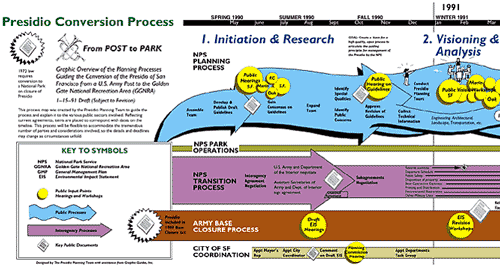
ChangeMap: Presidio
 ChangeMap:
Presidio full size image
ChangeMap:
Presidio full size image
Sibbet:
Any of these formats apply to icons on paper or words on paper
or words and icons on paper. One of my buddies, Bob Horn, in his
book Visual
Language has been studying the emergence of text-graphics
language like Group Graphics.
Conner:
Bob Horn
of informational mapping fame?
Sibbet:
Yes. He believes, and I’m somewhat persuaded by him, that
the tight integration of text and graphics is itself a new language,
a visual language. I found that by looking at the visualizing
processes themselves I could get a hierarchy of processes that
began to form a real visual grammar. The processes themselves
provided a foundation experience from which much of the base meaning
of the different format derived. Some formats were simpler and
became the basis for the next process. For instance, clustering,
more formalized, creates grids, and linked create diagrams. The
simpler formats can persist in the more complex ones, just like
in nature.
One
of the features of this process progression is that it takes on
increasing constraints, up to a point, and then turns to regain
some of the freedom lost in becoming more complex. The constraint
of a line, for instance, is that it flows in one direction. They
can be fat lines, thin lines, dotted lines, etc. but can’t go
in two directions at once. When spacing things, the constraint
is how close or far elements are in 2-dimensional space. This
is a bit more challenging than listing. You can’t pack too many
things in or it causes problems. In front of a group you can list
forever. You only have to keep it straight and keep going. With
a cluster, however, you begin to get clogged areas and packed
areas. It can overload people; they begin looking at it as “too
much,” like
you’re putting too many buttons on a screen.
Conner:
In some ways it’s a reflection of how we think.
Sibbet:
There’s a limit, you know. Six or seven distinctions are all the
brain can handle. We get beyond this limit by grouping things.
The human brain seems to understand better when something is neatly
categorized. If a grid is all filled out, we have to get the categories
then do the comparison, then understand the data in that joint
field that we can grid. It is a lot more complex and constraining
process than just listening.
If
you’re facilitating and want a group to get going and quickly
get the energy flowing, to get the ideas popping, you would not
work in a grid. You would work in a list. If you want to encourage
juxtapositions and activate comparative thinking, you’d use a
cluster.
Early
insight like this literally gushed out of applying process theory.
The going became more challenging with the complex graphics.
What’s
beyond a grid, I asked myself? Young saw plants as more highly
evolved that crystals, and claimed that there is a structural
clue—all plants have branching patterns. I immediately recognized
diagrams as the next format. A method popularized by Tony Buzan,
from England, is called Mind
Mapping. He claims the whole brain is set up to organize things
on branching patterns. These have different characteristics than
a grid. They can be much more complicated to read; they pack more
in; but they are freer in the actual process of making them. You
can branch anywhere, not just in a cell.
In
diagramming something on a mind map, you put a central idea in
the middle and then you put big branches of ideas and then set
up the twigs. When you use it as a way of displaying the group,
it always starts slowly and then, as it gets going, starts accelerating.
It’s a lot like what happens when you plant a real tree. It goes
slowly in the beginning and then, as it gets roots, it begins
to grow.
Conner:
So that’s an advantage?
Sibbet:
It depends. It’s tempting to introduce a value bias in a complexity
hierarchy, thinking complex is better or fundamental is better.
I don’t think complex is better than fundamental because if you
take fundamental away, you don’t have complex. But if you only
have fundamental, you wouldn’t have all the richness brought about
by complexity. A musician doesn’t say the C note is better than
the F note or that the music is better than the scale; he plays
the whole keyboard. That’s my organization bias. Value comes from
the purposes we have in relating to the world, not from the elements
themselves.
Young’s
perception was that when molecules figured out branching in the
DNA molecule and in polymers, they found the key to plant world
and growth, because branches can grow, where gridworks only expand.
In growing, they reclaim some of the freedom of movement lost
by becoming constrained molecules and crystals.
Conner:
They actually found a way.
Sibbet: In
Young’s scheme the next evolutionary stage is occupied by animals,
so I began thinking about graphics that can really move, and animate,
like animals. Animals have two degrees of freedom of movement
in space. It is unpredictable; in that, it can move unpredictably
in a new direction. But it is constrained in the direction it’s
going, much like a line. A duck’s not going to suddenly screech
to a stop and head the other way. That would defy the laws of
physics. But you can’t predict a ducks going up and down and sideways.
So, I look at these graphic displays and said, “Okay, what has
the property and can move like this?” I made an easy intellectual
mistake in thinking that movement is like flow, and flow charts
show movement so it must be flow charts. I published the Group
Graphics Keyboard in 1980 with this as the sixth pattern in my
series of “processes.” But it bothered me that flow charts were
so grid-like in look and in the feeling of what it took to create
them. This part was elegant, like the other distinctions.
Around
1984 I had another big eureka. In re-reading Young, I realized
animation occurs in a drawing when you point at something the
viewer already knows and they project movement into it. When you
add analogy and graphic metaphor to a graphic display, you turn
it into a drawing.
Let
me give you an example. I will often draw charts and, instead
of drawing a flat horizon line, I will draw an arced horizon line
and put a couple of little green blobs on it. What is that? It’s
an arching line and it has some green and then blue on the horizon.
But if you saw it, you would instantly see yourself in space looking
down at the Earth. The actual amount of information in that line
and in the blobs I draw is minuscule. The reason it works is that
everybody animates it with their own remembered view of the earth
from space—an overwhelmingly common image in our times. A whole
class of drawings uses this projective phenomenon to communicate
and they have a very different property than diagrams and displays
that don’t. You’ll see a lot of this in USA Today where
the charts look like the stuff that they are about and you instantly
get oriented to them and get involved in an interplay between
the graphic metaphoric and the data. These effects are strong
enough that they provide a lot of room for distortions as well
as quick perception.
At
the Grove we are transforming large vision murals into “drawings”
when we create landscapes of information in certain kinds of metaphorical
settings. One of our first big ones was a vision for National
Semiconductor. It seemed to me they wanted to go from being a
space barge to being the Enterprise, as in Star Trek. They wanted
to evolve into a “go where nobody has ever gone” kind of company.
But they were really a big freighter-type company producing thousands
of different kinds of semiconductors and parts. When we created
their vision in 1990, as part of their turnaround, we create a
16-foot long mural showing a space ship assembling itself and
taking off towards a vision. Midway it morphs into the Enterprise
and warp speed. Everybody knew the Star Trek metaphor and it was
right on for that vision. By the time we were finished with several
versions of this mural in 1994 NSC had 95% visionary recognition,
for the first time ever in the some parts of their world like
Malaysia. The company materially turned around; not just because
of our work, but we were a key part of it.
ChangeMap: National Semiconductor
ChangeMap:
National Semiconductor
full size
image
Creating
a drawing that animates meaning can be a double-edged. You rely
on the built-in experience of people to animate. If they don’t
have the experience, then there are two things they don’t know—the
data and the metaphor. In one project in the early 1990's we began
a project in Kenya to teach nurses how to teach nursing. We developed
a process model for the stages in teaching nursing and illustrated
it as a bouncing ball. The nurses in Kenya looked at the various
stages and said, “What is this step? Why is it up in the air?
Why aren’t they on the same level?" In Kenya it turns out
abstracting doesn’t work like it does here.
Conner:
I lived in Kenya and found the same thing to be true. I suspect
the bouncing ball didn’t work either.
Sibbet:
It’s a very concrete culture. We were not going to give up so
we asked, “What would really represent a big thing, a vision?”
They said climbing Mt. Kenya would be a big deal for most people
in Kenya. So, instead of a bouncing ball we used a zigzag road
going up Mt. Kenya. When we asked what do people use to go up
Mt. Kenya, I expected them to suggest a bus and saw planning as
a project to run the buses, and make the tires and everything.
Nope, they use bicycles. So, we ended up mapping our project management
model onto a bike going up Mt. Kenya, which they understood and
were totally happy about.
Conner:
Because it’s was their metaphor...

DTG
Community Change Model
Sibbet:
Right. And so, when you get into this realm of drawings and
what they mean, it’s a magical and complex world where you can
do amazing things.
All
these same principles apply to cyberspace design. This is how
patterns develop. We’ve discovered that the activity of wrestling
with metaphors, and what the organizing metaphors off a mural
or site should be, turns out to be a wonderful way to get people
to do systems thinking without all the heavy lifting. They don’t
need to memorize some archaic book. Looking at whether a setting
should be aquatic and underwater or illustrates as a jazz band
forces a very rich depth of analysis.
Gareth
Morgan has a wonderful book called Images
of Organization, which explores how, fundamentally, metaphors
organize our thinking about organizations. I’m pretty convinced
that what people mean by saying there’re organized is that they
can see how parts fit together in some integrated way. Ultimately
that way of “seeing” is display making. For humans it’s a graphic
3-dimensional display with 2-dimensional interface when we come
to representing it. When we start dealing with graphic representation
and metaphors, from a process perspective, they become literal
lenses on how people make sense of the world.
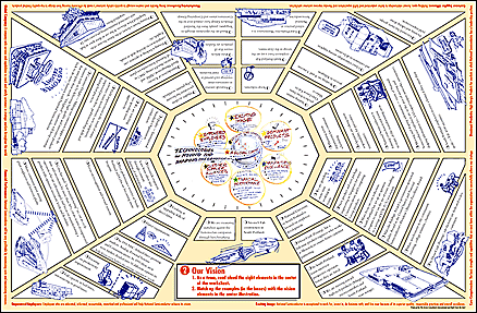
I
knew from the start that there was a format beyond drawing, a
pattern of ultimate complexity and inclusiveness. This would be
the “mandala” or circular drawing. For the brain to figure out
how everything relates to everything in a central way requires
the most amount of insight. In a macro kind of way, it takes us
back to the point of it all—to see the world in a whole way. This
is what we try to do at the Grove.
Thanks
for listening. I hope this gave you a little bit of how process
theory has become integrating theory behind not only the graphics
we create but also most of our organizations, and how we work.
As we think so we are.
Conner:
Thank you so much, then, for sharing who you are.
David
Sibbet is the founder and president of the Grove Consultants
International. Visit him online at www.grove.com. Grove inspired
graphic facilitators are now working around the world, helping
transform the art and practice of collaboration with visual tools.
Marcia
Conner is Editor-in-Chief of LiNE Zine and CEO of Learnativity.
She can be reached at marcia@linezine.com
or www.learnativity.com.
DSMC122000GR
Copyright (c) 2000-2004 LiNE Zine (www.linezine.com)